
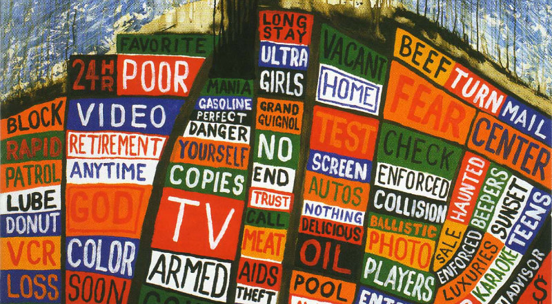
Super normal is the artificial replacement for normal, which with time and understanding may become grafted to everyday life There’s a creative intent at work here, even if that intent may be regarded not so much as designing, but simply not going...
There is no model; there is only color. In order to change a color it is enough to change the color of its background. Why do two colors, put one next to the other, sing? Can one really explain this? No. White...
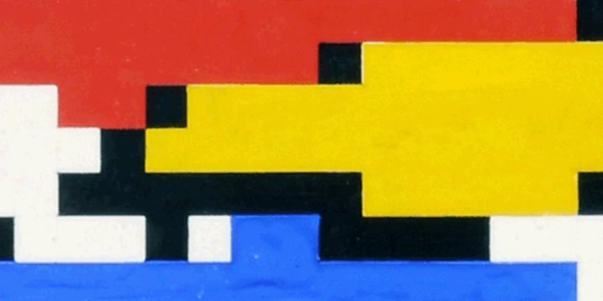
Why an artificial Mondrian? Perhaps there’s an obvious and immediate affinity between his iconic compositions and such computer-generated figures as those that appeared in Japan’s IBM Review in 1964. But Hiroshi Kawano did not simply digitize Piet Mondrian; it could be stated...
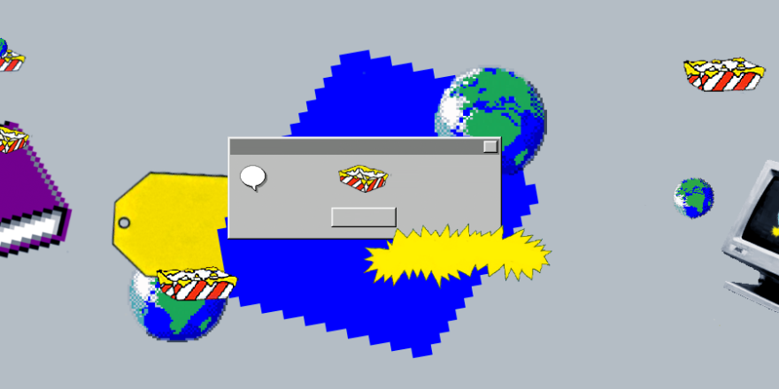
In 1995, the Windows operating system reached a certain threshold. Microsoft’s iterative design approach allowed for more cycles of prototyping and user-testing than a typical project span would allow. It became more refined before it went public, resulting in something that felt...
Smithe is a fresh-faced illustrator and graffiti artist from Mexico City whose work can be seen as far afield as lovely Brooklyn. His tangled comic book geometries and retro science fiction metamorphoses without end are appealing enough. But it’s the disparate love affairs...
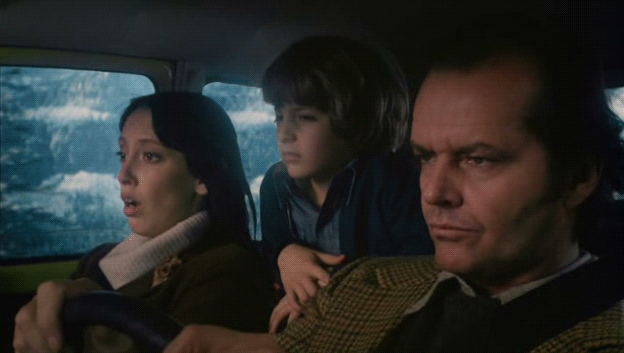
In the spirit of hurricane-induced house arrest, we offer yet another series of cinemagraphs to continue our celebration of Kubrick’s distinctive mise-en-scene, which we began a while back with 2001. What better cure for infrastructural paralysis than the desolate-yet-claustrophobic creepiness of being trapped inside with...
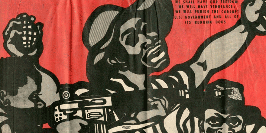
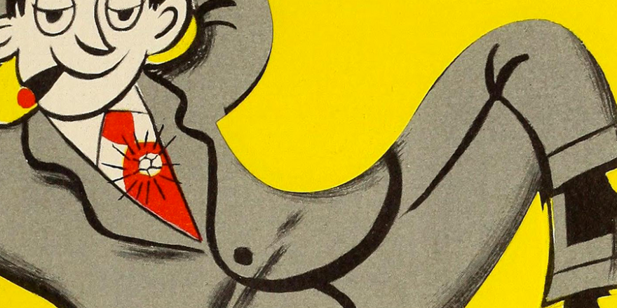
Emory Douglas worked as the Minister of Culture for the Black Panther Party for Self Defense from 1967 until the discontinuation of the Party in the 1980s. He’s been called the “Norman Rockwell of the ghetto”, and is known for his powerful...
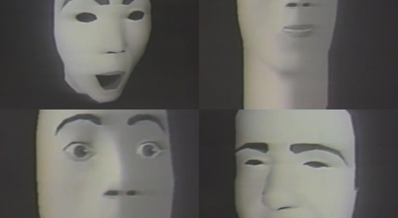
In 1974, Frederic Parke received a PhD in computer science from the University of Utah College of Engineering, where he also created the first computer generated physically-modeled human face. Parke’s original idea of virtual modeling has seen exponential advancements as technology that...

Maybe you’ve never heard of Ian Brignell, a Toronto-based logotype designer, but chances are you’ve seen his work. In fact, unless you’re hiding in an abandoned missile silo in the remote Siberian tundra (as we are), or in some post-capitalist haven (Toronto), it’s likely...
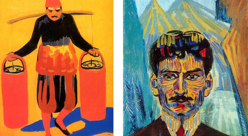
Martiros Saryan (1880-1972) was an Armenian painter regarded for his masterful selection and use of color. Inspired by the likes of Henri-Émile-Benoît Matisse and Eugène Henri Paul Gauguin, Saryan captured a sentimental slice of Armenian life in his minimal landscapes, meticulous still...
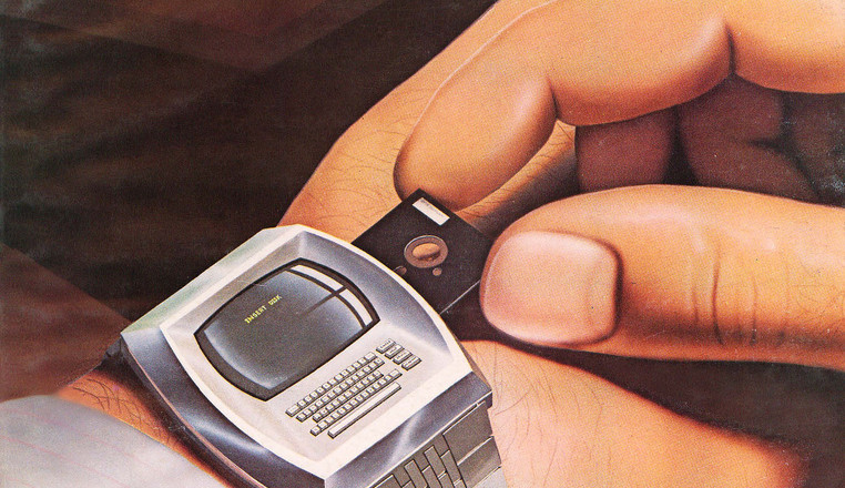
The dawn of the age of personal computing in the late ’70s and early ’80s offered what may now seem like quaintly outmoded fancies. But so far, many of the basic principles formulated in those early days of small systems programming seem...
We’ve been admiring the colorful, curvaceous work of Berlin-based Icelandic designer Siggi Eggertsson for some time now. His artwork for Pólýfónía, our favorite album from fellow Icelanders Apparat Organ Quartet, packs quite a powerful punch, devoting a brilliant, iconographic vignette to each track, all the while...
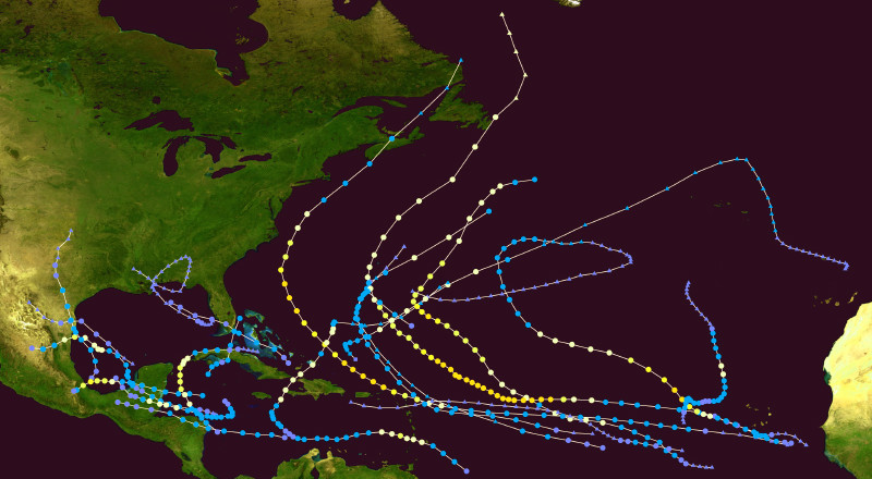
With city transit at the mercy of what’s been dubbed “Frankenstorm,” we here in evacuation Zone C have found ourselves with ample time to remain indoors and contemplate the aesthetics of hurricane visualizations. Although an Ancient Greek mantle like Athena would’ve perhaps...
Emerson called New York City “a sucked orange.” We’ll take it as a compliment, because today’s an orange-letter day here at Overhead Compartment, wherein we offer some curated delicacies of a tart persuasion. The scent of citrus is in the air, a...
Stanley Donwood, which is the pen name of English artist and writer Dan Rickwood, has been collaborating with Radiohead on album covers and posters since 1994. In exploring his diverse body of work, which includes various types of prints, paintings and written...
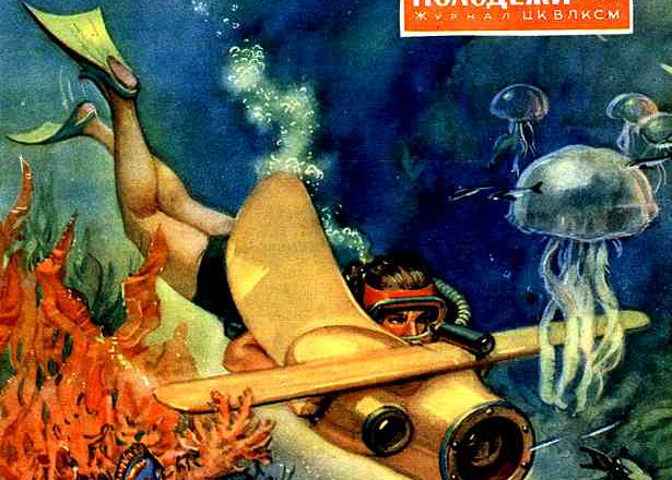
These fantastical, futuristic Russian cover illustrations for Technology-Youth are absolutely brilliant in all of their inventiveness and characteristic Cold War optimism. via Things Magazine
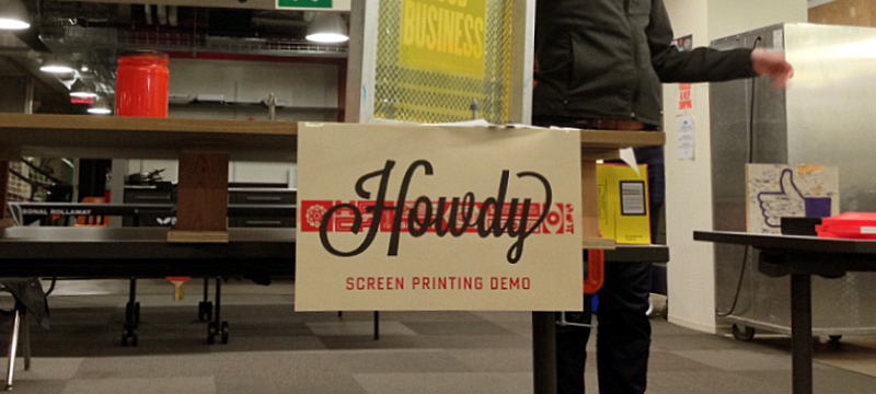
This week we had the opportunity to hang out with the Analog Research Lab, a hidden gem of a screen-printing studio started by designers Ben Barry and Everett Katigbak which operates out of the basement of Facebook headquarters. Barry and Katigbak began...
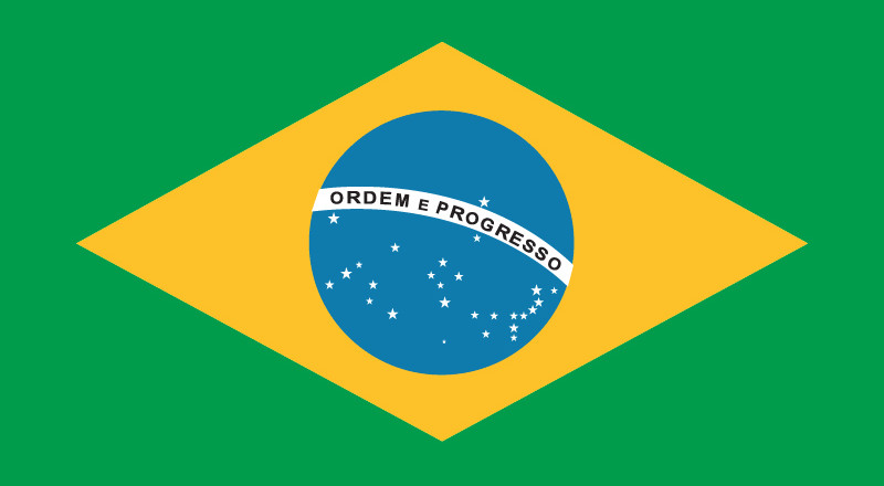
The Brazilian national flag is striking in its contrasts: the colorful, orderly geometry centered against a constellational smattering of stars, the straightforward sans-serif typography against its subtle contoured encasing, suggestive of a sphere. It’s impossible to escape the elegance of the Brazilian...
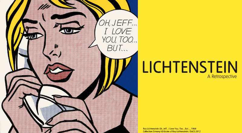
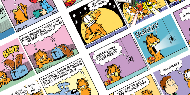
Lichtenstein: A Retrospective will be opening at Tate Modern early this Spring, showcasing 125 of the artist’s most renowned paintings and sculptures. With his ironical appropriation of comic book imagery, advertising, and cartoon illustration, Lichtenstein irreverently challenged the limits of how art functions within...